

The market is too expensive. You’ve read some version of that sentence a dozen times this year, and it isn’t coming from nowhere.
Then-Fed Chair Jerome Powell said as much directly, telling reporters in a September 2025 speech that “by many measures, for example, equity prices are fairly highly valued.” Robert Shiller - the economist whose valuation model this entire conversation revolves around - has his own 10-year forecast for the S&P 500 based on that model: an average annual nominal return of roughly 1.5%, with a wide range that includes the possibility of losing money over the decade. And multiple financial outlets have noted that the market’s Shiller P/E ratio is now the second-highest reading in the 155 years the data covers - behind only the peak of the dot-com bubble.
That’s a lot of smart, credentialed people pointing at the same number and using words like “overvalued” and “expensive.” The number itself is worth understanding before deciding whether it should change anything about how you invest.
What is P/E ratio really?
A P/E ratio is price divided by earnings - the basic measure of how expensive a stock, or an entire market, looks. The most common version, called trailing P/E (short for trailing twelve-month P/E), divides price by the most recent one year of earnings. It’s a reasonable starting point: paying more for a dollar of profit should, in theory, mean lower future returns per dollar invested.
The problem is sometimes the bottom half of the ratio. One year of earnings is a noisy, unstable thing to divide by - a write-off, an accounting charge, or another one-time hit can crater a single year’s reported profit even when the underlying business hasn’t changed much at all. In 2009, that’s exactly what happened: trailing S&P 500 earnings fell so far, so fast, that trailing P/E topped 120 - not because stocks were 120 times overpriced, but because one year of reported profit had all but disappeared right as the market bottomed.
This is not a new problem, and the proposed solution is decades old. In 1988, economists John Campbell and Robert Shiller published a paper in the Journal of Finance arguing that averaging earnings over many years provides a better measure of a stock market’s underlying value than relying on a single year’s profits. Instead of letting one unusually good or bad year dominate the calculation, they showed that using a long history of inflation-adjusted earnings produces a more stable gauge of fundamental value. Their work laid the foundation for what later became known as the Cyclically Adjusted Price-to-Earnings (CAPE) ratio, or Shiller P/E, which divides prices by the average of the previous ten years of real earnings and has since become one of the most widely used measures of long-term market valuation.
You don’t need a crisis year to see the gap between the two. Right now (July 2026), trailing P/E for the S&P 500 is about 32 - elevated, but not historically extreme. CAPE, on the same market, at the same time, reads about 42 - the second-highest level in 155 years. Same company earnings, same stock prices, two meaningfully different measures on how expensive the market is, because the two ratios are asking different questions: one about the last 12 months, one about the last decade.
How well does CAPE predict market movement?
Follow-up research since Campbell and Shiller’s original 1988 paper has confirmed a key idea: valuation ratios have some ability to predict long-run returns - a real but far from perfect relationship. Campbell and Shiller tested this themselves in a 2001 update, using U.S. data back to 1871 alongside quarterly data from twelve other countries since 1970, and found the pattern held on a far larger dataset than their original study. How well CAPE predicts market movement in the short term is not clear from the existing literature.
So I looked at the data myself: every month of CAPE and S&P 500 data since 1950, checked against what actually happened over the following 1, 3, 5, and 10 years. This isn't an attempt to replicate the literature or a rigorous academic exercise. It's a plain look at what the numbers actually show, without the academic jargon that usually comes wrapped around it.
Here’s exactly what my analysis involved. Multpl.com publishes a monthly CAPE reading for the S&P 500 going back to 1871; I used the post-war slice of it, January 1950 through today - 76 years, more than 900 individual months. For every month from 1950 on, I took two numbers: what CAPE was reading at the start of the month, and what the S&P 500’s price did over the 1, 3, 5, and 10 years that followed. Note this analysis looks at price change only. I excluded dividends on purpose, to isolate the valuation-to-price relationship specifically rather than mixing in income.
That gives four separate questions asked of the same data: if you’d known nothing except the CAPE reading on a given month, how much would that have told you about where the market was headed over each of those four windows?
The chart below shows relationship between CAPE value and annualized return at 1, 3, 5, and 10 years for each month in the data, one plot for each time window.
CAPE vs. Forward S&P 500 Returns - Post-WWII (1950–2026)
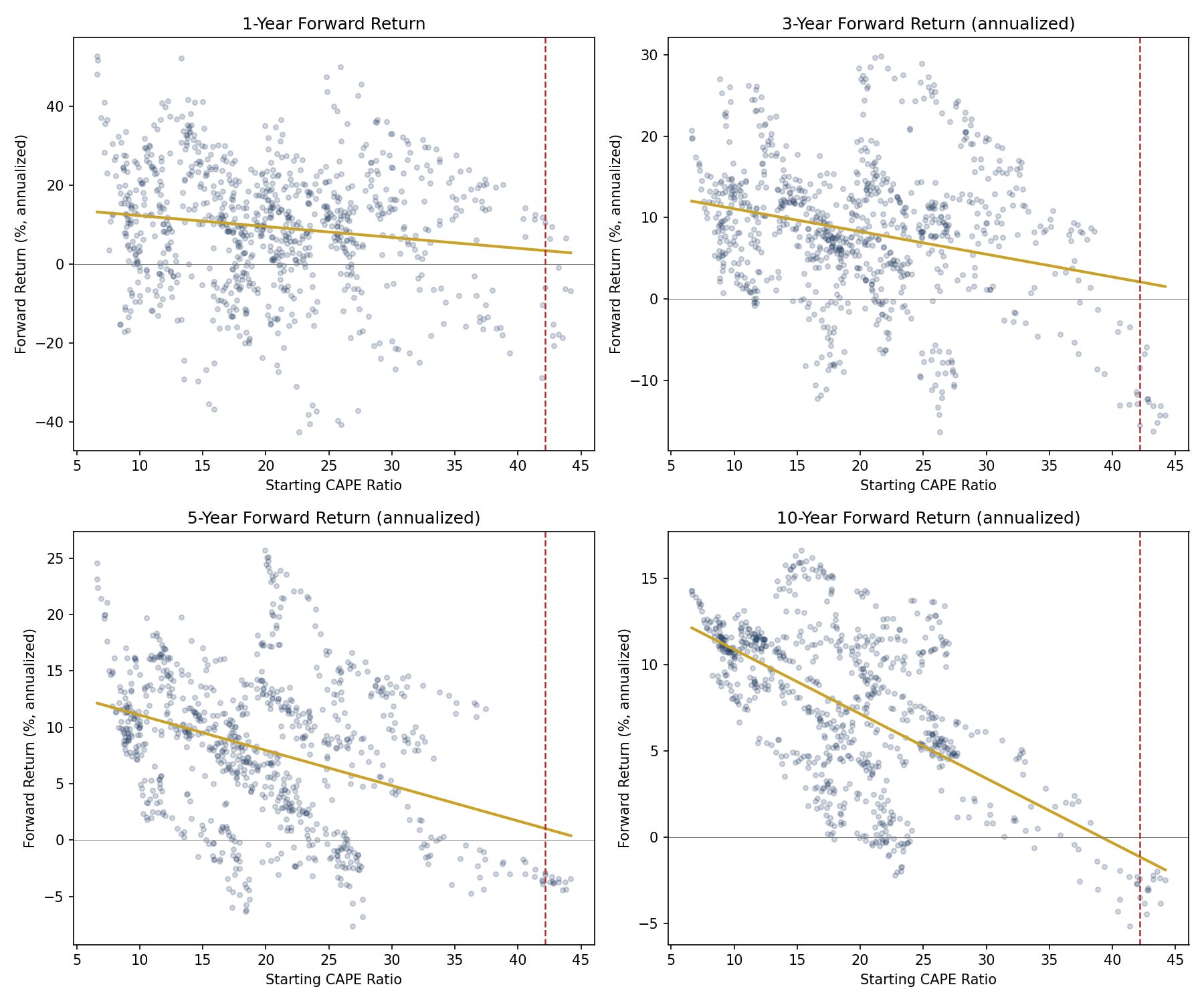
Source: Analysis of S&P 500 price and CAPE value from multpl.com. Red line indicates current CAPE at around 42.
Look at how the cloud of dots changes shape as the time horizon gets longer, left to right, top to bottom. Each dot is one month: its position left-to-right shows what CAPE was reading that month, and its position up-and-down shows what the market’s price actually did over the years that followed. At 1 year, it’s a wide scatter with no visible shape - a high starting CAPE and a low one produced roughly the same range of outcomes, meaning valuation told you almost nothing about the next 12 months. The pattern becomes progressively clearer as the horizon lengthens, where expensive starting valuations have historically been associated with meaningfully lower subsequent returns. Even at its strongest at 10 years, though, there’s still a wide range of outcomes at every valuation level: plenty of expensive-looking months still turned out fine, and plenty of cheap-looking ones didn’t turn out as well as you’d expect. Valuation is one input among many, and it takes years for its effect to separate from the noise.
Even a negative relationship at a 10-year horizon should be read with real caution - it rests on remarkably thin history. Every month since 1950 with a CAPE within the neighborhood of the current CAPE of 42 falls inside one narrow window: January 1999 through September 2000, the run-up to and peak of the dot-com bubble. All of them went on to post negative 10-year annualized returns, roughly -2% to -5% a year. But because those months overlap so heavily with each other, they're really one historical episode, not 21 independent tests of what happens at this valuation level. That's the entire post-war record of what follows a CAPE this high - a single instance, not a pattern, and it shouldn't be read as a forecast. That one episode also had its own specific drivers - the dot-com bubble was a fairly narrow, sector-concentrated mania - that CAPE alone doesn't capture. A different high-CAPE episode, shaped by different market dynamics and business fundamentals, could play out very differently, for better or worse.
The key takeaway: CAPE is a much better tool for predicting price moves a decade out than for the next year or a few years. But even at that longer horizon, CAPE’s practical value is limited right now - a reading this extreme has only happened once before in the post-war era, so there’s barely any history to judge it against.
What I’m actually doing with this
Short term: nothing. A high CAPE doesn’t predict a crash in the next year or two - but that’s not the same as saying one won’t happen. CAPE just doesn’t carry a signal either way at that horizon. Either way, I invest with a decades-long horizon, and short-term volatility doesn’t matter to that anyway.
Long term, the 10% long-run average hasn’t changed - what’s different is the specific decade ahead. That average is unchanged because it already includes both the strong decades and the weak ones. The high S&P returns of the last 10–15 years were an above-trend run, and mean reversion could indicate a below-trend stretch in the next decade.
That being said, no one knows what the return will be for the next decade. Wall Street’s own forecasters are split. Goldman’s David Kostin forecast just 3% annualized returns in October 2024, with CAPE around 38 at the time - one voice in a chorus of Wall Street strategists warning of a lost-decade ahead for stocks, while Goldman’s Ben Snider raised that forecast to 7% in June 2026, arguing higher profit margins and interest rates that remain below their long-run historical average justify a permanently higher multiple.
For me, whether any of this matters depends on where I am. If I’m decades from retirement, or if I’ve already saved enough, it’s irrelevant - a multi-decade plan absorbs one weak decade fine. If I’m close to retirement and counting on sustained high returns from the S&P for the next decade, I may need to make adjustments - save more now, or plan a leaner retirement budget.
Either way, I will keep holding and keep investing, on the same terms I already had.
I am not a financial advisor. Nothing in this newsletter is investment or tax advice.
Fine Print Investing publishes weekly. Where are you in this - decades out, on track, or leaning on the last decade’s returns to get there? Hit reply, I’d like to know.